Fragmented context
Useful information existed, but riders had to reconstruct it every time the medium changed.
 Oliver Nguyen
BART · Independent wayfinding concept
I studied the full rider journey, then designed one color-and-number identity that carries from trip planning to the station, train, and exit.
A testable system hypothesis, not a claimed transit result.
Color tells riders which line. Numbers tell them which stop.Project snapshot
Useful information existed, but riders had to reconstruct it every time the medium changed.
The design unit became the full trip—not a sign, a map, or a mobile screen in isolation.
Route color plus stop number repeated at each decision point to replace recall with recognition.
Context · Every minute matters
Navigation happens while trains approach, doors close, crowds move, and attention is divided. The job is not to show everything. It is to make the next decision obvious.
Which line?
Which direction?
How many stops?
Which exit?
Field research
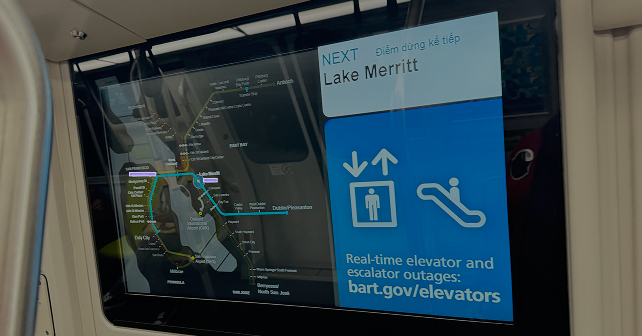
Across 15+ rides in three weeks, I photographed signs, timed decisions, and watched where riders hesitated. The pattern was not one broken sign. It was repeated loss of context.

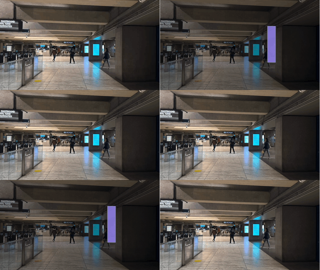
Small signs competed with advertisements, architecture, and crowd movement.
A complete system map demanded too much attention for a time-sensitive choice.
Unfamiliar station names became a memory task once the rider boarded.
Exit guidance arrived late and disconnected from the rider’s destination.
How research changed the direction
Make the signs clearer.
Improving one artifact would treat a local symptom. The next handoff would recreate the problem.
System research
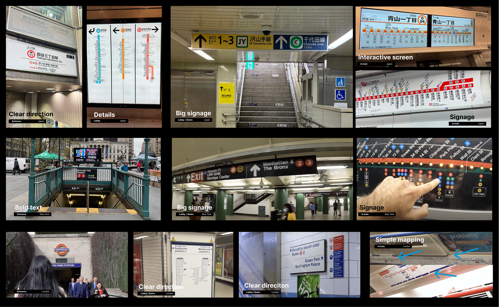
New York, Tokyo, and London showed the value of compact identifiers repeated across touchpoints. BART still needed a model shaped around its own network and rider context.
The call I made
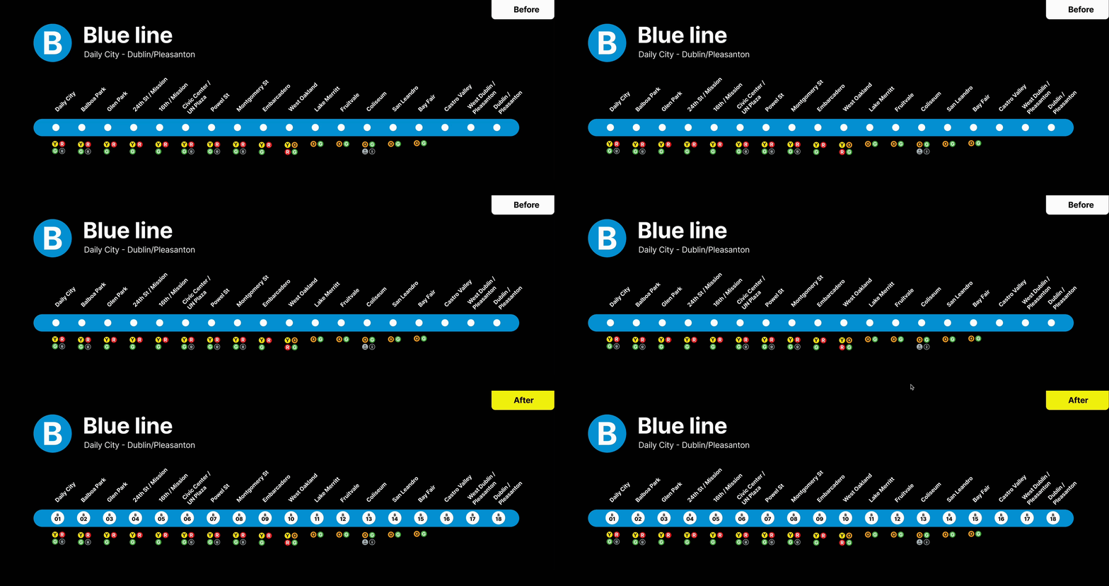
Color creates immediate line recognition. A sequential number gives each stop a short, stable identifier. Names remain visible; the new code supplements rather than replaces them.
Prioritization
Searching
Hesitation
Recall
Exit stress
01 Identify
02 Track
03 Exit
Trip planner
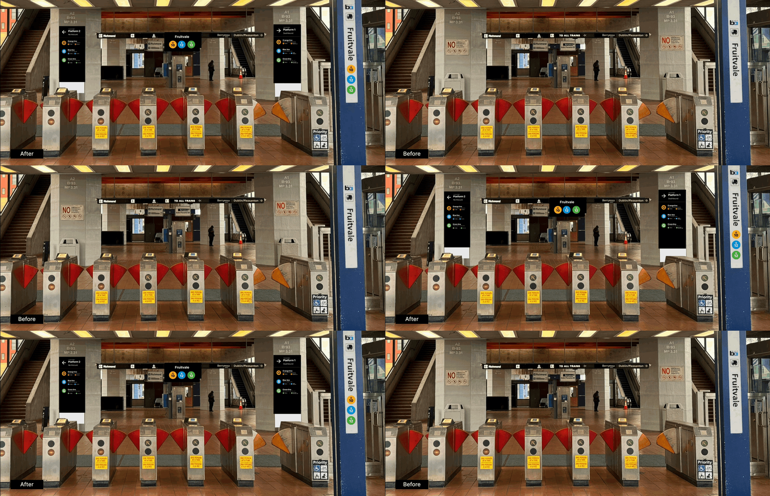
Station + platform
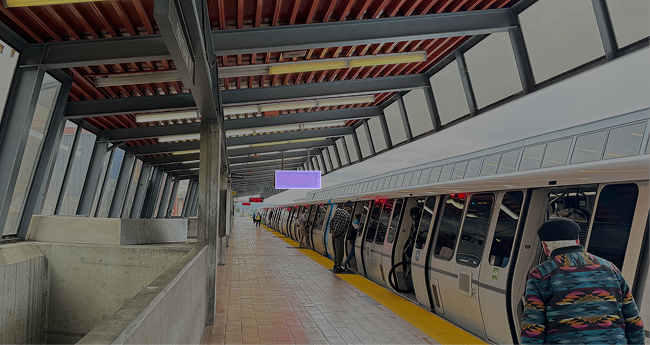
Onboard progress
Exit guidance
Final concept
Instead of asking riders to interpret the system again, every touchpoint confirms the same line and stop sequence while revealing only the information needed now.
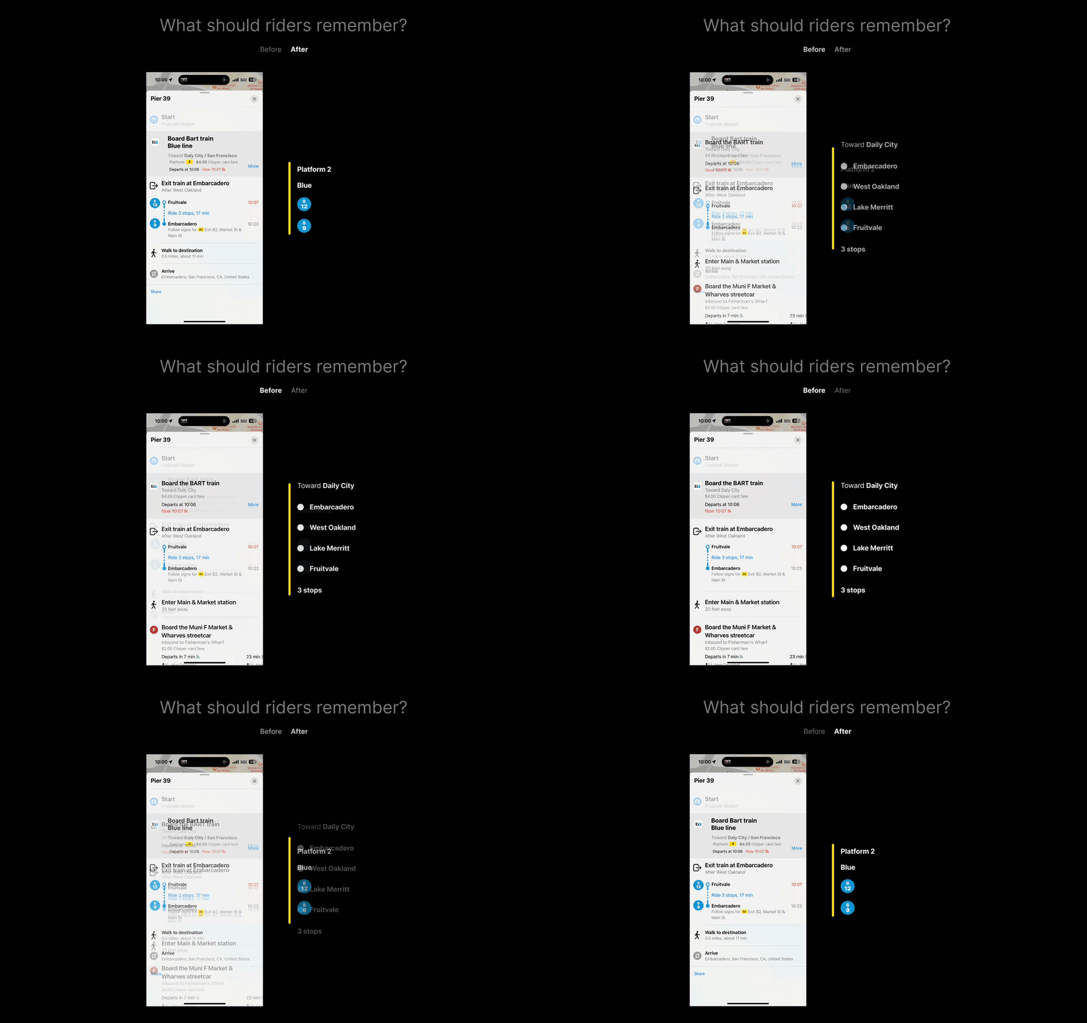
Plan · Mobile
Apple Maps carries the line color and stop number into the physical journey, reducing the translation between phone and platform.
DecisionDo not invent a separate digital shorthand.
Concept test · Embarcadero Station
I used paper prototypes with five riders at Embarcadero, then conducted three follow-up interviews. The goal was comprehension—not whether the mockup looked modern.
Wait, that’s it? Blue line, stop 12?
Rider response reported in the original project
This is a promising qualitative signal from a small test—not proof of system-wide usability or impact.
Outcome + reflection
Mobile, station, platform, onboard progress, and exits share the same route identity.
The first rider test suggested that color plus number could make the next action easier to repeat.
BART did not commission or implement the concept. System ridership figures are context, not results.
Reflection
The project changed how I think about wayfinding: clarity does not come from making every artifact simpler. It comes from making the relationship between artifacts predictable.
More of the system
Supporting explorations show how the same information model could reduce recall and make the final station-to-street transition easier to confirm.